


No items found.

For Community Chest Durban, the brief was clear: restore visual order to a 90-year-old institution whose identity had been diluted by time and inconsistent stewardship.
The project began with a recommendation from Tenley Voogt, whose collaboration with the studio on content strategy revealed a need for more than just words. The organisation required a complete rebrand, one that would stabilise its visual language and amplify its impact.
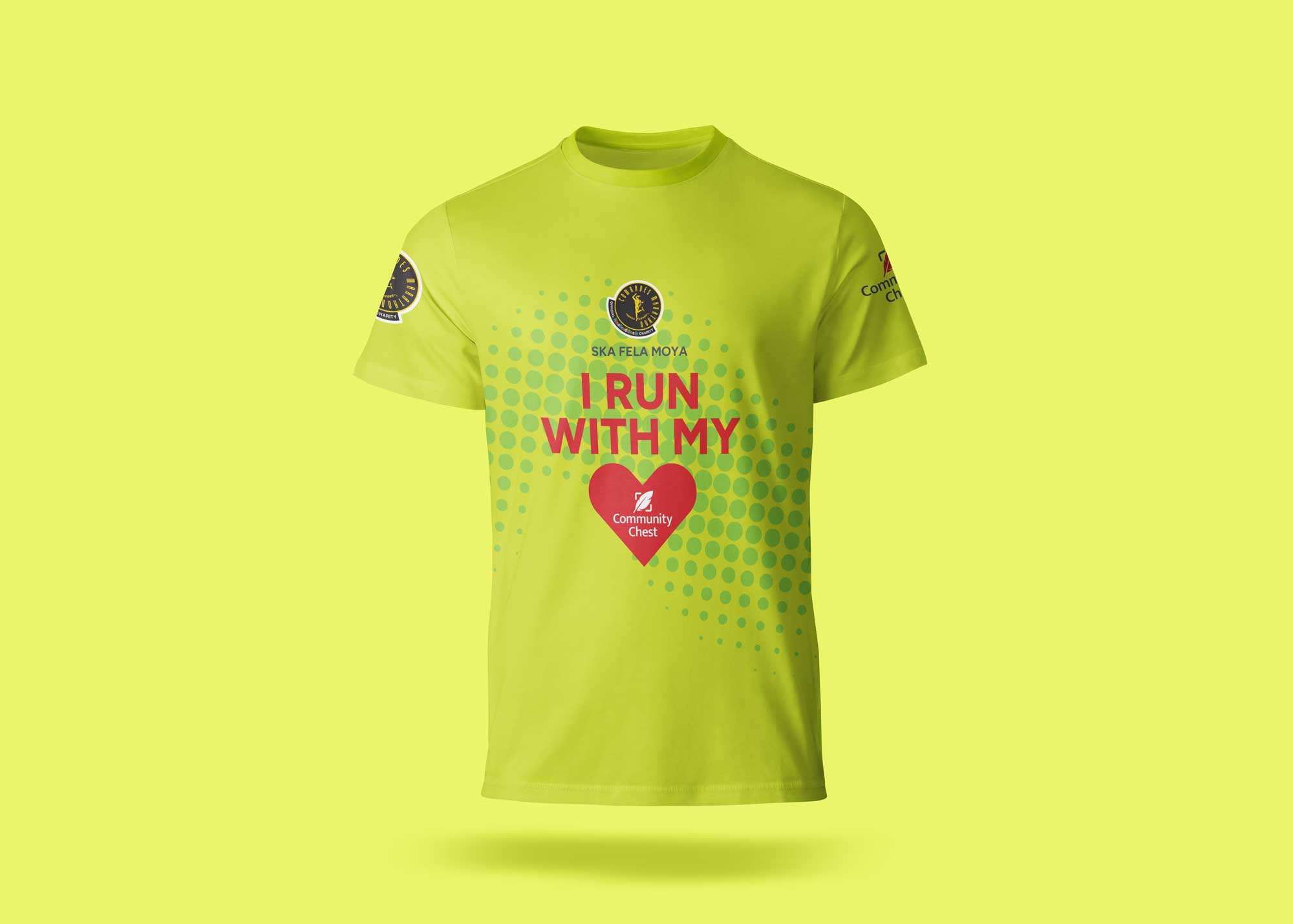
The brandmark, though rich in heritage, had suffered from years of neglect. Successive agencies had layered on elements like the word Ubuntu, creating conflict and eroding recognition in a market where trust is paramount. The red feather, a symbol of the organisation’s history, needed to be retained but distilled to its essence. By applying visual logic and stripping back the noise, the mark was restored to its most effective form.
This clarity extended across every touchpoint. Stationery, advertising, social campaigns, point of sale and print media, from brochures to annual reports, were all rebuilt on a modern foundation. The digital realm followed the same principles, ensuring the organisation could communicate with speed and precision. The result is a brand that serves as a model of intentional design, where every element supports the mission. When visual language is deliberate, its power to extend reach is undeniable.
The rebrand started an ongoing relationship of brand custodianship for the studio. Ongoing committed relationships benefit everyone: the team get to share ideas and knowledge, there is an incentive to invest in learning, enquiry and continual improvement.
Subscribe by clicking below to receive new Substack articles when they are posted.